
Blog

From surface to strategy: Drawing diagrams to persuade and align

Bridget Lawrow
July 13, 2026
Bridget Lawrow
July 13, 2026

Tap into your diagramming skills to break down complex problems, sell ideas, clarify priorities, focus on the user, and more.

Content folks are more skilled than ever. We’re engineering context for AI, shaping design systems, and influencing product strategy. So why are so many of us still getting looped in at the end to polish the surface? How might we make our voices heard, seize decision-making power, and show up as indispensable partners early in the process? 

Let’s set down our sentences and embrace diagramming to unpack complexity and put content first. Stepping up to the (sometimes virtual) whiteboard has helped me navigate highly regulated and design-dysfunctional organizations. These tried-and-true diagrams can help inspire “aha” moments and amp up your credibility among cross-functional partners, from the engineering team to the C-Suite. 

So let’s uncap our markers and learn a few beginner-friendly frameworks to set up content projects for success. By drawing pictures, you’ll spotlight your strategic skills while creating clarity for everyone. 

Calm chaos and prevent scope creep using the MoSCoW method 

If you join a project with ambiguous requirements, I recommend the MoSCoW method. MoSCoW is a prioritization framework that sorts features or tasks into four categories:

  1. Must have
  2. Should have
  3. Could have
  4. Won’t have

This simple diagram visualizes all the possible features for your product/solution/flow, then forces the team to narrow and describe their priorities for the initial launch. 

By leading the MoSCoW method, I drove our priorities during my contract at the United States Department of Agriculture (USDA). The UX designer and I kicked off a massive project with a mere four sentences in Jira to guide us. We first led two hour-long working sessions with the team to clarify requirements for a complex new feature, ensuring that unspoken expectations were met and that everyone felt understood and bought into the design process.

Example list of features or requirements, ready to sort into MoSCoW categories

How to do it:

  1. Schedule an hour with all the relevant stakeholders: business leaders, designers, developers, PMs, and anyone else who has opinions about what your product should do.
  2. Before the meeting, brainstorm every discrete requirement, capability, and/or feature the product could perform and jot it on a (virtual) sticky note. Get granular. For example, if the product is an AI chatbot, your sticky notes might read, “allow the user to access their conversation history,” or “allow the user to give feedback on the chatbot message.”
  3. At the meeting, start by sharing the features you brainstormed and ask your participants to discuss them. Did they envision anything that’s missing from your initial list? Anything that they would remove?
  4. Sort your stickies into four categories:
    1. Must have: the critical features your product needs to be successful in this launch, where you’ll focus the most time and effort
    2. Should have: the second-most important features that are next in line to design 
    3. Could have: the third-most important features that likely won’t make it into the first release, but could be follow-ups for the future
    4. Won’t have: the features that will definitely not be included 

As your stakeholders negotiate where to rank each feature, encourage the developers and designers to estimate the size and ROI of each feature: Is this high or low effort? Is it highly feasible or super complex? What’s the value of this feature to the business and the user? By the end of the session, you'll have a shared list of your highest-priority requirements—and, ideally, an even longer list of ideas that can wait until later or be cut altogether.
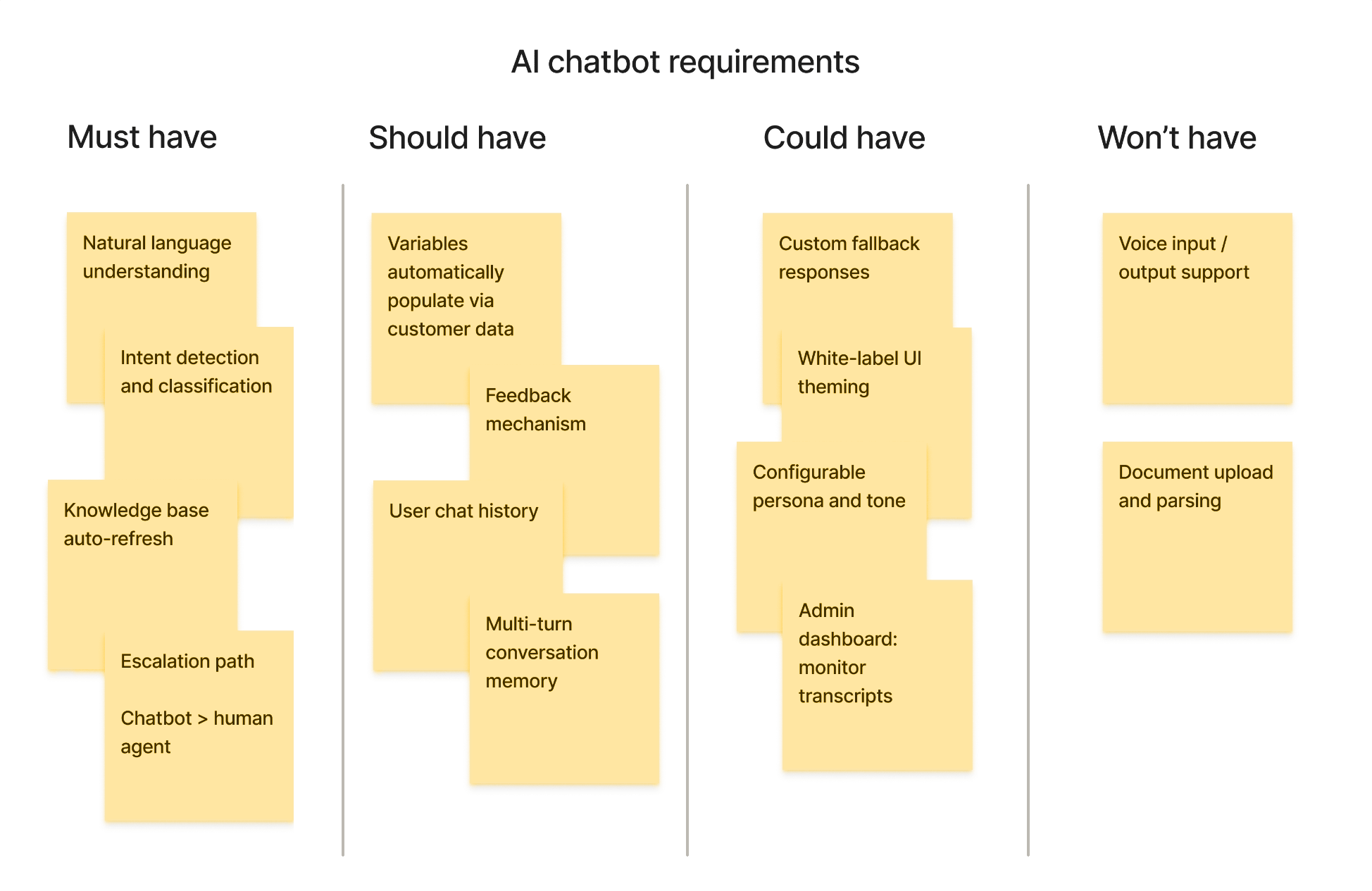
Example MoSCoW framework: features have been ranked by priority

Align designers and engineers using flow diagrams and sketches

In the world of content, we love our words. From UX copy and support articles to AI prompts and user stories, we’re accustomed to describing our ideas in words. But I encourage you to give yourself permission to draw pictures instead. Not a natural artist? Worry not. If you can draw boxes, arrows, stick figures, and smiley faces, then you have the skills you need to sketch flow diagrams.

Let’s pretend you have an idea that will solve a big, ugly pain point for your audience. Or pretend you’re part of a team that’s executing on someone else’s brilliant design (that lives in their head). You could have endless conversations about how that thing will work. Or instead, you could draw it!
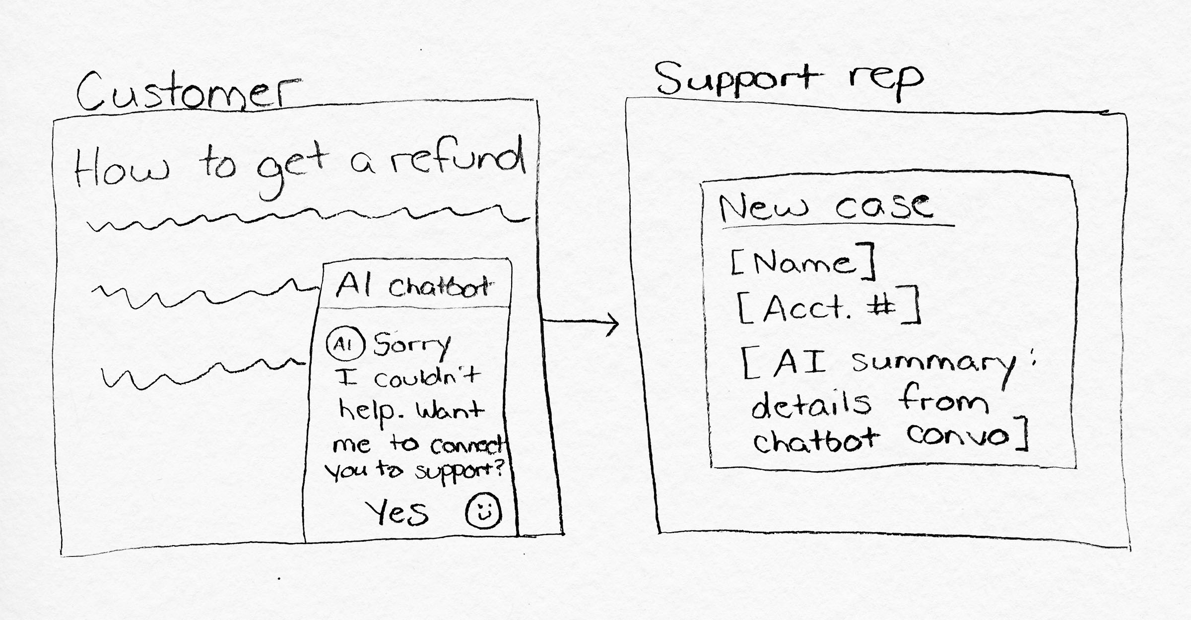
Sketch of an AI chatbot escalating a customer support request to a human agent. The chatbot offers to connect the customer to support, and the agent receives a new case with the customer's information and an AI-generated summary of the conversation.

How to sketch your idea:

  1. You can work in FigJam, Miro, or on paper. I like drawing with pencil and paper so I can edit my drafts. Start by drawing screens, buttons, and dialog boxes.
  2. Write placeholder headers and captions describing what’s happening on the screen. 
  3. If this experience unfolds over multiple screens, draw an arrow and sketch additional screens too. 
  4. Write a scenario or user story describing the person who is using your design, what they want to get done, and what they get out of the interaction. 

Next, share your drawing for feedback. Explain that you’re showing a rough sketch to depict your thoughts, and you know the UX designer will have lots of feedback and edits. For now, it’s just a concept. If it’s imperfect, that’s great: Messy sketches prove to your design partners that the concept is a work in progress, which invites them to build upon your idea. 

You may discover that stakeholders who typically nitpick proposals or slide decks tend to “yes and” your sketch. There’s something about a drawing that begs improvisation and imagination — which your perfectly crafted narrative simply can’t compete with.

Subscribe to the Button newsletter!

Get more valuable content design articles like this one delivered right to your inbox.

Thanks! Check your inbox to confirm your subscription.
Oops! Something went wrong while submitting the form.

Focus on customer needs by creating journeys  

My favorite diagram is the tried-and-true journey map. Some of the best work of my career began by stepping into the shoes of my target audience and mapping their journey as they interact with a product or brand. When stakeholders participate in mapping efforts, there’s no shortage of “aha” moments. When leaders widen their view to understand the messy worlds our users live in, they finally realize we need to fix the broken handoffs, confusing flows, and inconsistencies in their journeys.

As a content designer at a global ticketing platform, I used journey mapping to shine a spotlight on our single-biggest customer pain point: lost tickets. By mapping and evangelizing the journey, our team broke down silos and worked together to prevent the missteps and confusion that lead to bigger trouble later in the event attendee’s journey. We forged new partnerships with designers who explored numerous solutions, then redesigned key moments,  helping ~350,000 users in the first year. 

In an ideal world, you would conduct user research to co-create your audience’s journey. But that approach is expensive and lengthy, so I’ll describe a speedier method to map journeys. 

  1. Choose the journey and set the scope. Which audience do you want to focus on? What task are they trying to accomplish? Where does their journey begin, and how do you know it’s complete? Journeys can be mapped at various levels of zoom, so be intentional about your focus.
  2. Get your data. Delve into the research you have on your audience to find evidence for how the audience proceeds through their journey. Web analytics, call center data, user interviews, A/B tests, and anecdotal feedback are all valuable here. If you don’t have much data, you can make a few assumptions here.
  3. Gather your stakeholders. Host a workshop with folks who are familiar with this journey and who have a stake in the outcome: everyone from UX writers and designers to PMs and directors. Aim for 5-8 people with varying perspectives.
  4. Map the journey together. Grab your sticky notes and start mapping. My journey maps typically include a few rows: user actions, thoughts, feelings, pain points, opportunities, and channels. Start by mapping their actions, in sequence. Then step back through the journey to fill in the other rows.
  5. Vote on the moments the team wants to solve. Give all the stakeholders 3-5 dot stickers and ask them to vote on the pain points and opportunities they think are most important to solve, to improve the user’s journey. Now you have some priorities and several bought-in collaborators to support your work.
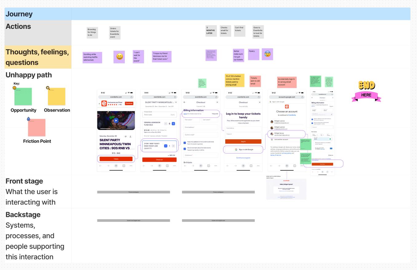
Example journey map, shown zoomed-out to hide proprietary details

In conclusion 

Ambiguous requirements, stakeholders rushing to execution, ignoring user needs — these are your moments to draw diagrams to guide decision-makers. In my experience, leaders rarely reject the teammate who steps up to say, “I can help us align and prioritize,” or “I have an idea to solve this problem.” The frameworks here won't make organizational dysfunction disappear, but they will make your thinking visible, your priorities legible, and your value harder to ignore. Put down the paragraph. Pick up the marker.

Share this post

Join us for Button 2026

Tickets are on sale now! Our virtual conference returns this September with practical talks, live Q&As, and a community that feels like home. Spend two (or three!) days exploring inspiring content design sessions grounded in real-world work and challenges.

Author

Bridget Lawrow is a voracious learner and a content fangirl — she’s happiest organizing workshops, debating button copy, and leading user research. She has 11 years’ experience in content design/strategy; working in tech, government, enterprise, and higher ed. Bridget also earned her master’s degree in strategic communication from the University of Minnesota.

As Director of Content Strategy at a financial services firm, she helps drive AI tools and solutions.

Illustrator

Sean Tubridy is Creative Director and Co-Owner at Button Events.

Find out how you can write for the Button blog.

From surface to strategy: Drawing diagrams to persuade and align

Bridget Lawrow
July 13, 2026
Tap into your diagramming skills to break down complex problems, sell ideas, clarify priorities, focus on the user, and more.

Content folks are more skilled than ever. We’re engineering context for AI, shaping design systems, and influencing product strategy. So why are so many of us still getting looped in at the end to polish the surface? How might we make our voices heard, seize decision-making power, and show up as indispensable partners early in the process? 

Let’s set down our sentences and embrace diagramming to unpack complexity and put content first. Stepping up to the (sometimes virtual) whiteboard has helped me navigate highly regulated and design-dysfunctional organizations. These tried-and-true diagrams can help inspire “aha” moments and amp up your credibility among cross-functional partners, from the engineering team to the C-Suite. 

So let’s uncap our markers and learn a few beginner-friendly frameworks to set up content projects for success. By drawing pictures, you’ll spotlight your strategic skills while creating clarity for everyone. 

Calm chaos and prevent scope creep using the MoSCoW method 

If you join a project with ambiguous requirements, I recommend the MoSCoW method. MoSCoW is a prioritization framework that sorts features or tasks into four categories:

  1. Must have
  2. Should have
  3. Could have
  4. Won’t have

This simple diagram visualizes all the possible features for your product/solution/flow, then forces the team to narrow and describe their priorities for the initial launch. 

By leading the MoSCoW method, I drove our priorities during my contract at the United States Department of Agriculture (USDA). The UX designer and I kicked off a massive project with a mere four sentences in Jira to guide us. We first led two hour-long working sessions with the team to clarify requirements for a complex new feature, ensuring that unspoken expectations were met and that everyone felt understood and bought into the design process.

Example list of features or requirements, ready to sort into MoSCoW categories

How to do it:

  1. Schedule an hour with all the relevant stakeholders: business leaders, designers, developers, PMs, and anyone else who has opinions about what your product should do.
  2. Before the meeting, brainstorm every discrete requirement, capability, and/or feature the product could perform and jot it on a (virtual) sticky note. Get granular. For example, if the product is an AI chatbot, your sticky notes might read, “allow the user to access their conversation history,” or “allow the user to give feedback on the chatbot message.”
  3. At the meeting, start by sharing the features you brainstormed and ask your participants to discuss them. Did they envision anything that’s missing from your initial list? Anything that they would remove?
  4. Sort your stickies into four categories:
    1. Must have: the critical features your product needs to be successful in this launch, where you’ll focus the most time and effort
    2. Should have: the second-most important features that are next in line to design 
    3. Could have: the third-most important features that likely won’t make it into the first release, but could be follow-ups for the future
    4. Won’t have: the features that will definitely not be included 

As your stakeholders negotiate where to rank each feature, encourage the developers and designers to estimate the size and ROI of each feature: Is this high or low effort? Is it highly feasible or super complex? What’s the value of this feature to the business and the user? By the end of the session, you'll have a shared list of your highest-priority requirements—and, ideally, an even longer list of ideas that can wait until later or be cut altogether.

Example MoSCoW framework: features have been ranked by priority

Align designers and engineers using flow diagrams and sketches

In the world of content, we love our words. From UX copy and support articles to AI prompts and user stories, we’re accustomed to describing our ideas in words. But I encourage you to give yourself permission to draw pictures instead. Not a natural artist? Worry not. If you can draw boxes, arrows, stick figures, and smiley faces, then you have the skills you need to sketch flow diagrams.

Let’s pretend you have an idea that will solve a big, ugly pain point for your audience. Or pretend you’re part of a team that’s executing on someone else’s brilliant design (that lives in their head). You could have endless conversations about how that thing will work. Or instead, you could draw it!

Sketch of an AI chatbot escalating a customer support request to a human agent. The chatbot offers to connect the customer to support, and the agent receives a new case with the customer's information and an AI-generated summary of the conversation.

How to sketch your idea:

  1. You can work in FigJam, Miro, or on paper. I like drawing with pencil and paper so I can edit my drafts. Start by drawing screens, buttons, and dialog boxes.
  2. Write placeholder headers and captions describing what’s happening on the screen. 
  3. If this experience unfolds over multiple screens, draw an arrow and sketch additional screens too. 
  4. Write a scenario or user story describing the person who is using your design, what they want to get done, and what they get out of the interaction. 

Next, share your drawing for feedback. Explain that you’re showing a rough sketch to depict your thoughts, and you know the UX designer will have lots of feedback and edits. For now, it’s just a concept. If it’s imperfect, that’s great: Messy sketches prove to your design partners that the concept is a work in progress, which invites them to build upon your idea. 

You may discover that stakeholders who typically nitpick proposals or slide decks tend to “yes and” your sketch. There’s something about a drawing that begs improvisation and imagination — which your perfectly crafted narrative simply can’t compete with.

Subscribe to the Button newsletter!

Get more valuable content design articles like this one delivered right to your inbox.

Thanks! Check your inbox to confirm your subscription.
Oops! Something went wrong while submitting the form.

Focus on customer needs by creating journeys  

My favorite diagram is the tried-and-true journey map. Some of the best work of my career began by stepping into the shoes of my target audience and mapping their journey as they interact with a product or brand. When stakeholders participate in mapping efforts, there’s no shortage of “aha” moments. When leaders widen their view to understand the messy worlds our users live in, they finally realize we need to fix the broken handoffs, confusing flows, and inconsistencies in their journeys.

As a content designer at a global ticketing platform, I used journey mapping to shine a spotlight on our single-biggest customer pain point: lost tickets. By mapping and evangelizing the journey, our team broke down silos and worked together to prevent the missteps and confusion that lead to bigger trouble later in the event attendee’s journey. We forged new partnerships with designers who explored numerous solutions, then redesigned key moments,  helping ~350,000 users in the first year. 

In an ideal world, you would conduct user research to co-create your audience’s journey. But that approach is expensive and lengthy, so I’ll describe a speedier method to map journeys. 

  1. Choose the journey and set the scope. Which audience do you want to focus on? What task are they trying to accomplish? Where does their journey begin, and how do you know it’s complete? Journeys can be mapped at various levels of zoom, so be intentional about your focus.
  2. Get your data. Delve into the research you have on your audience to find evidence for how the audience proceeds through their journey. Web analytics, call center data, user interviews, A/B tests, and anecdotal feedback are all valuable here. If you don’t have much data, you can make a few assumptions here.
  3. Gather your stakeholders. Host a workshop with folks who are familiar with this journey and who have a stake in the outcome: everyone from UX writers and designers to PMs and directors. Aim for 5-8 people with varying perspectives.
  4. Map the journey together. Grab your sticky notes and start mapping. My journey maps typically include a few rows: user actions, thoughts, feelings, pain points, opportunities, and channels. Start by mapping their actions, in sequence. Then step back through the journey to fill in the other rows.
  5. Vote on the moments the team wants to solve. Give all the stakeholders 3-5 dot stickers and ask them to vote on the pain points and opportunities they think are most important to solve, to improve the user’s journey. Now you have some priorities and several bought-in collaborators to support your work.
Example journey map, shown zoomed-out to hide proprietary details

In conclusion 

Ambiguous requirements, stakeholders rushing to execution, ignoring user needs — these are your moments to draw diagrams to guide decision-makers. In my experience, leaders rarely reject the teammate who steps up to say, “I can help us align and prioritize,” or “I have an idea to solve this problem.” The frameworks here won't make organizational dysfunction disappear, but they will make your thinking visible, your priorities legible, and your value harder to ignore. Put down the paragraph. Pick up the marker.

Share this post

Find out how you can write for the Button blog.

Join us for Button 2026

Tickets are on sale now! Our virtual conference returns this September with practical talks, live Q&As, and a community that feels like home. Spend two days exploring inspiring content design sessions grounded in real-world work and challenges.

Sign up for Button email!

Be the first to hear about Button events, free content design resources, and special offers.

Thanks! Check your inbox to confirm your subscription.
👉 IMPORTANT: Firewalls and spam filters can block us. Add “hello@buttonevents.com” to your email contacts so they don’t!
Oops! Something went wrong while submitting the form.