


In content design, we talk a lot about clarity, empathy, and design systems. We build personas, create voice guidelines, and obsess over microcopy that removes friction. But in fast-paced, high-growth environments, we might get the question, “What’s the ROI of your work?” We may have strong cases for content design creating better experience or processes, but often, the question-askers expect something different.
When working for a high-growth industry or an international company where design is interpreted differently, or where priorities may lean more toward products over experience, everyone must prove that their work contributes directly to business outcomes. And for content designers, whose impact often unfolds invisibly, this pressure can feel like a race to justify our existence.
To tackle this issue, I started looking at A/B testing, not as a marketing buzzword or a growth-hacking exercise, but as a way to visualize our storytelling strategy.
The measurement gap in content design
In design conversations, we often hear: “You can’t quantify words.” It’s true: you can’t measure empathy, tone, or flow with a single metric. We talk about design systems, component libraries, or accessibility frameworks. Yet we rarely discuss the measurement systems behind content decisions. We document voice principles but seldom link them to observable outcomes.
This creates a measurement gap — the space between what content teams believe they influence and what the organization can see that they influence. And until that gap closes, content work will always be seen as craft, not a strategic discipline.
A/B testing, when applied with intention, helps close that gap. It translates qualitative improvement into quantitative signals, not by turning creativity into math, but by telling a design story through metrics.
A/B testing as a language of alignment
When I first introduced A/B testing into our content workflow at Bybit — a centralized cryptocurrency exchange — it wasn’t about proving who wrote the “better” copy. It was about alignment.
Working in an extremely fast-paced industry with a lot of market volatility and constantly changing user trends, our product teams are always time-pressed to deliver the quickest time possible to capture user attention and deposits. This means converting attention into depositing money on the platform, which should then theoretically convert into investment moves. Given the volatility of digital assets, building trust and the desire to convert are vital.
In this environment, the priority often goes to pushing as many features and options as possible. But if the results don’t add up, management may start raising eyebrows.
During low seasons, it’s often hard to sustain user interest for long. No matter what product owners do, from adding new discounts to pushing more product-driven ads, there are just fewer people signing up or making deposits. The immediate question from leadership is, “Why are the numbers still low? How do we get people to deposit?” My instinct is different: asking if the copy itself has room for improvement.
After a recent slowdown in conversions, I hypothesized that our microcopy and call-to-action phrasing weren’t addressing the right motivations. Instead of guiding, the copy merely described or hard-sold the product, without much consideration for the user and their immediate journey. And for a product that handles financial actions, description isn’t enough: users need reassurance and clarity, and we needed to build trust.
As a result, we built two variants of a landing page for an ongoing campaign to attract new users. This evergreen campaign was designed to illustrate the platform’s ease of use and the lack of barriers to investment. However, we discovered the existing copy was cluttered, overly product-driven, and contained scores of grammatical mistakes. The improved variant, on the other hand, was designed to be streamlined, clear, and conversion-focused.
- Version A: The existing copy — minimal, product-oriented, information-heavy
- Version B: A redesigned flow with conversational, explanatory copy that made benefits explicit and guided users step-by-step
The results were astonishing. Version B saw conversions jumping to 7% — a statistically significant improvement driven purely by clearer messaging. Version A, with its more simplistic UI, showed little change. But the conversation that followed was the real breakthrough.
For the first time, product managers and executives weren’t just hearing that copy mattered — they were seeing it. The numbers didn’t just validate the experiment. They created a shared language for understanding how clarity, confidence, and context shape behavior and impact monetization.
Get more valuable content design articles like this one delivered right to your inbox.
From testing outputs to system insights
The biggest misconception about A/B testing is that it’s about winning variants. In reality, it’s about understanding systems.
Each test becomes a feedback loop for us to dig deeper and find out what exactly works:
- Did users respond better to a conversational tone because it humanized the experience?
- Did explanatory text reduce uncertainty, or does the problem lie with UX/UI?
- Did our changes help one market but not another — and what does that say about localization strategy?
In one of our later experiments, we tested localized versions of promotional pop-ups across multiple markets. The English control copy was longer, product-driven, and functional. The optimized version was more uplifting, direct, and driven by fear-of-missing-out. While the test in English overwhelmingly favored the optimized version, deeper data told an unexpected story. Markets like Brazil responded strongly to messages with upbeat, energetic language. Japan and Indonesia, on the other hand, performed better with neutral, formal phrasing.
Subsequent copy sets were then adapted by in-house translators, who were encouraged to experiment with tone — some added urgency, while others leaned on reassurance.
The insight wasn’t simply “X tone converts better.” It was that tone that reflects trust. And trust behaves differently across cultures.
By sharing those results with localization and brand teams, we moved beyond campaign metrics and into brand system calibration, gradually adjusting how our voice flexes globally, without losing coherence.
Quantitative proof, qualitative growth
These experiments gave us two outcomes: one tangible, one cultural.
First, we established a direct link between content decisions and business results. Clearer copy increased click-through and conversion rates. Accessible explanations reduced drop-offs. This showed that once we get the content design right, business results follow.
Second, we gained organizational credibility. Our content team wasn’t just fixing words; we were generating insights. Those insights became fuel for conversations about tone, design systems, and user trust across markets — discussions that used to happen without us.
When content designers can show that better words lead to measurable growth, they stop being service providers and start being strategy partners.
Yet, the point isn’t to turn creativity into numbers. It’s to use numbers to tell the story of why clarity matters.
As time went on, we embedded our A/B testing efforts into the product team. Instead of raising our own A/B testing initiatives, we now work very closely with product owners and are available to support whenever new product hypotheses arise.
We also suggested quarterly CTA updates and audits. We do this by evaluating conversion-critical user journeys and identifying key dropoff points. Then, we suggest copy or CTA changes, based on hypotheses, to test over two weeks. The winning versions will be put into a repository for future use.
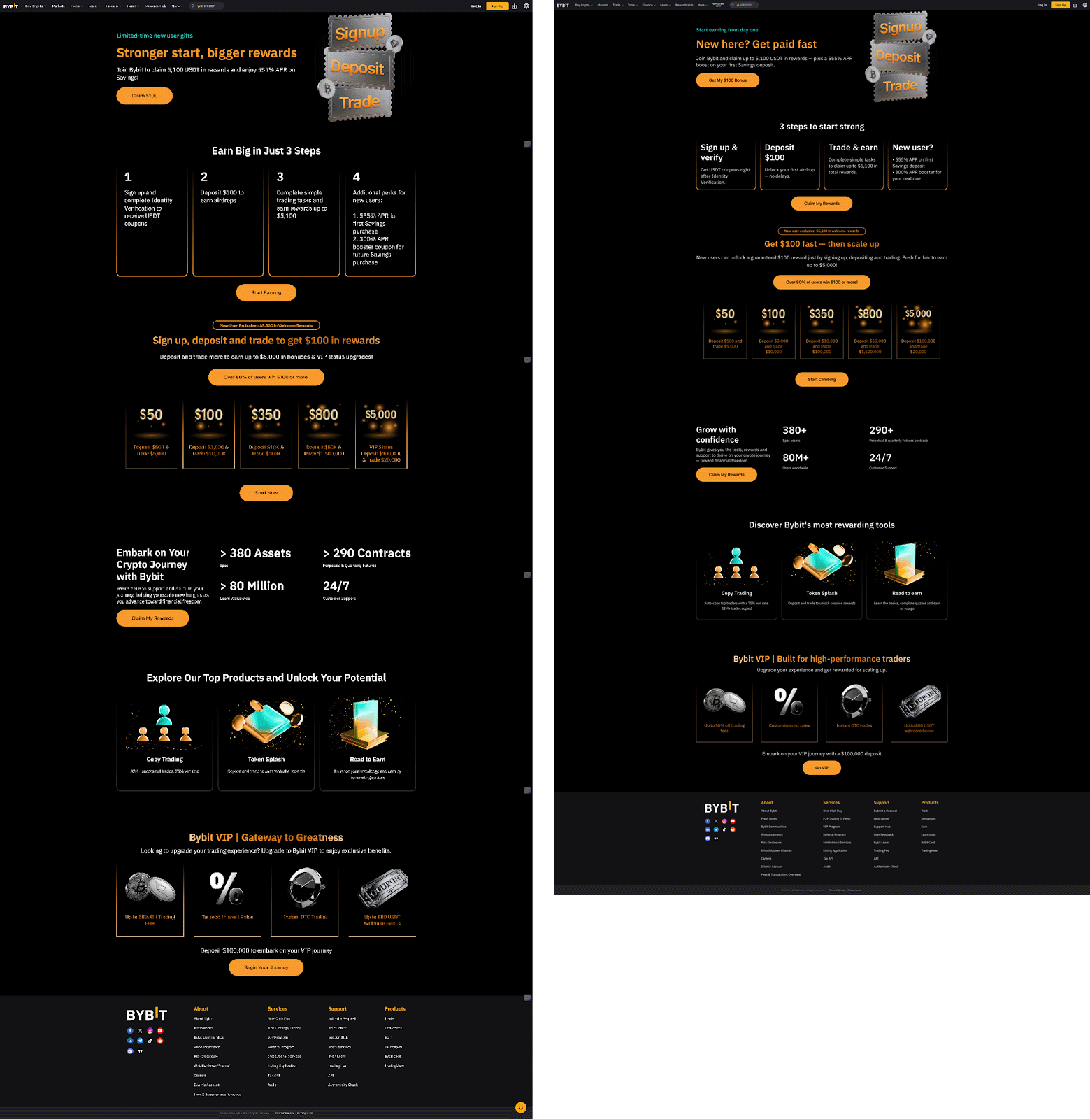
Below is an example of our landing page A/B test. The control on the left contains grammatical mistakes and UI mismatches. The variant on the right involves fixing the obvious mistakes and making navigation easier via clearer copy. The result was immediate: conversion jumped to 6.3% with the variant on the right.
Making A/B testing a sustainable practice
A/B testing is only as strong as the questions you ask. In content, the goal isn’t to chase micro-optimizations — it’s to find the optimal setting that converts best.
Here’s how we’ve approached it sustainably:
Test hypotheses, not headlines
Each experiment starts with a hypothesis. For example: “Users hesitate to deposit because the call-to-action lacks reassurance.” The test isn’t about “Button A vs. Button B” — it’s about understanding what drives action.
Embed testing into content design workflows
Testing shouldn’t be an afterthought at launch. It’s part of how we write. From information hierarchy to tone guidelines, every design decision should have a measurable intent.
Close the loop with storytelling
When results come in, we translate them into stories for leadership. Not “Version B won by 7%,” but “Simplifying copy helped new users understand what to do next, which reduced hesitation.” This proves our impact and insights instantly.
Document, don’t just celebrate
Every test should feed a shared repository of what language works, where, and why. Over time, this organic document is fine-tuned and becomes our content quality system, informing both design and brand.
A/B testing as a cultural signal
What we wanted to demonstrate the most wasn’t the results, but a shift in perception.
For too long in product-driven or numbers-driven companies, copy governance has been seen as an afterthought. Copywriters would have drafts dictated to them and were expected to do a token brush-up or simply say, “Yes, I sign off.”
Now, with a few case studies under our belt, product leaders have started involving content designers earlier. They’ve started asking questions like, “Can we test this flow before launch?” or “What message would work best for new users in this flow?”
And as more teams have adopted this mindset, our design maturity has grown, and we’ve earned organizational trust through evidence. Though it takes time to change the organizational culture, making this effort shows that copy isn’t just based on taste or authority; it’s grounded in user behavior. When you can quantify empathy, even imperfectly, you give yourself a seat at the strategic table.
Final thoughts
A/B testing taught me that evidence isn’t the enemy of creativity. It’s the foundation that lets creativity scale.
At the end of the day, we’re not testing copy. We’re testing understanding, and what helps motivate people to act. Every data point is a story about a human choice. And when those stories are told well, the business impact of content design becomes self-evident beyond words.
Join us for Button 2026
Tickets are on sale now! Our virtual conference returns this September with practical talks, live Q&As, and a community that feels like home. Spend two (or three!) days exploring inspiring content design sessions grounded in real-world work and challenges.

