
Have you ever experienced the “requirement salad”? Remember those times when you’re assigned something in a part of the product, and then four different people want to meet with you to “pass on context,” and because you’re a good designer, you go, “Yeah, that’s good! I need context. I thrive on it. Breathe it, even.” The meeting comes, and suddenly, what you need to design and write turns into a scary Frankenjourney. Everyone has a different thing they want you to add to the text: “We need to talk about X,” “We need to make sure the user sees Y,” “Z is a huge business push, so we need to highlight that.”
Typically, in these scenarios, designers inevitably end up talking about who the audience is and what the audience is trying to do. These are classic go-tos, but there’s another side to words in the product than just the audience.
The UI, what we see, is one big representation of the system we don’t see. When we design, we actively choose representations for the things in the hidden system by using icons, words, boxes, spacing, and more. Words are even more tightly bound to this hidden system. The moment we add words to a UI, they represent concepts the user has to understand to be successful. Content designers craft groups of words, and those words take on a specific purpose, a job, in this giant system of tech and design.
Obviously, “purpose matters” isn’t new thinking. We talk about it all the time, but I’ve found that I need something extra to explain this to collaborators. Asking, “What’s the job of this content?” is helpful in that it changes the conversation from the “requirement salad” to something more focused. Something that makes it easier to say “this doesn’t, or does, do its job.”
The framework
Over the last few years, I’ve realized that the “jobs to be done” framework doesn’t just apply to why users choose products, but also to the choices designers make within products. As a designer on a design system team, I realized this first in working with our components, but later realized it was also true for words. It gave me a framework to help me collaborate with others in a way that removed “vibe writing” out of the equation.
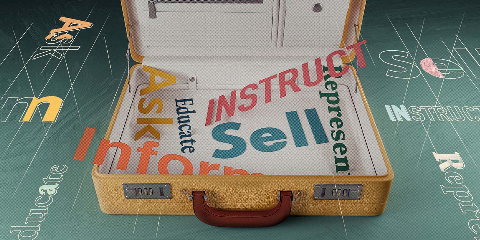
I call this framework “the six jobs of words in products.” (Super flashy, I know), and it’s helped me set clear boundaries of what the content I’m writing needs to do, which allows me to write more clearly.
The six jobs
Generally, there are six jobs that words can have in a product:
- Inform
- Educate
- Sell
- Ask
- Represent
- Instruct
For example, warnings have the job of notifying the user that something bad might happen or that an action they’re about to take might impact their workflow in an undesired way. The outcome of the warning is that the user understands the consequences and makes an informed choice. Getting the user to take an action, one way or the other, isn’t the main job. The main job is to make sure the user understands the consequences of what they’re about to do.
If the job is to ask, our words should incite a response: “Is this suggestion correct?” If the job is to sell, our words should show the benefit and value to the user: “To increase your data limits, upgrade to Pro.”
The beauty of these categorizations is that each of these jobs has a specific outcome you can measure. If your onboarding text isn’t educating, then it isn’t doing its job. If your upsell message isn’t converting, then it isn’t doing its job. Obviously, there are cons that come with this simplification, but that shouldn’t be a surprise to anyone in design. Simple is simple until it’s not simple. That’s okay. (See caveat #3.)
A few caveats before we move on:
- Words are supported by design. I know that if I don’t state this, everyone will hit the comments to say, “But sometimes it’s not the words’ fault that they aren’t doing what they are saying; it’s the supporting design. Do you even UX, bro?” Yes. This is true! Sometimes, clearly written messages fall to their supporting design.
- Longer content can have more than one job. It’s often the case that content that informs can also be content that educates. Content that represents may also be content that informs. We won’t get to that here, but it is a thing.
- Every page and screen is a smorgasbord of content with different jobs because context is king. Obviously, a screen is going to be made up of tons of different content. This content is always going to be in context. An inline message is connected to a specific element; an alert is going to talk about a specific process. Each of these things has its own job to do.
- There are always edge cases. Inflexible frameworks are useless against the 0.03% edge case that shouldn’t even exist but has been conjured up by an incredibly strange series of events that no one could’ve seen coming. The “butterfly flaps its wings in Singapore and a tree grows in New York” sort of edge case. So, as with all frameworks, it’s best to let them do the heavy lifting 80% of the time and take the other 20% as it comes. This is the tension we must live in as world-builders. This is the way.
Get more valuable content design articles like this one delivered right to your inbox.
Job 1: Inform
Lets the user know that an action they’re about to take will impact their work, that a process has failed, or that something will happen, has happened, can happen, or needs to happen.
This is done most often with:
- Confirmation modals
- Alerts
- Banners
- Toasts
- Tags
- Emails
- Push notifications
- Empty states
Examples
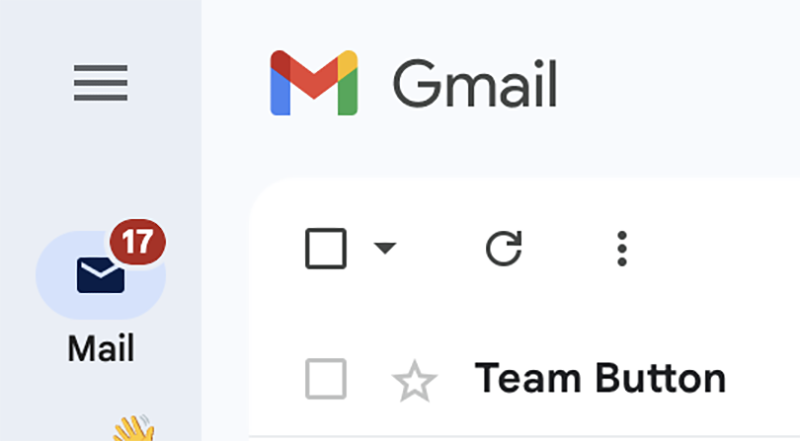
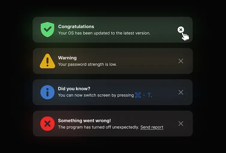
The badge on your email that says “17” is informing you that you have 17 new emails. You don’t need to do anything about it, but now you know.
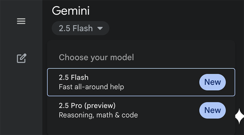
The badge on the model item informs you that the model is new. You don’t have to do anything about it, but it gives you additional information you can use to make a decision.
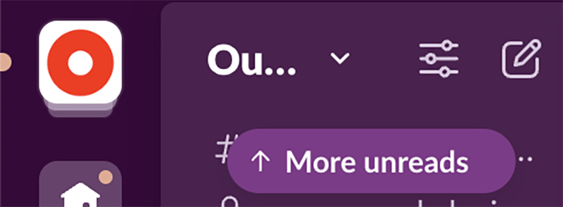
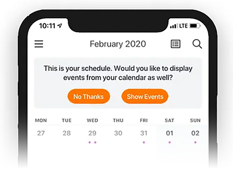
Slack’s “More unreads” lets you know, “Hey, there’s stuff you haven’t read above here.” It’s not teaching you anything; it’s just telling you additional context that you can choose to act on.
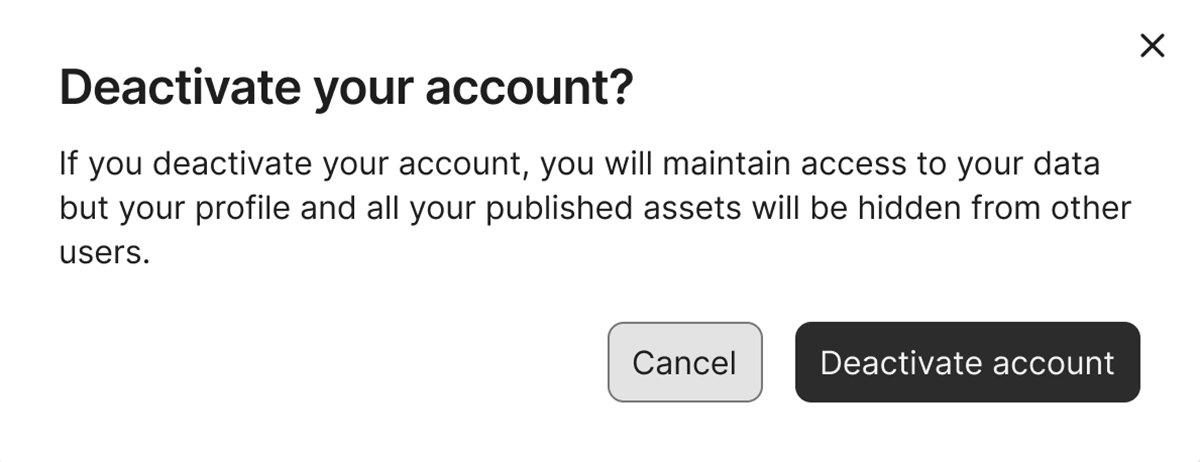
This confirmation is letting you make an informed choice by telling you what happens when you deactivate your account.
Job 2: Educate
Helps the user gather context, understand, and navigate so that they can use the product successfully.
This is done most often with:
- Wizards
- Page header descriptions
- Empty states
- Inline content
- Onboarding
- Tooltips
Examples
Here, the text below each label is about education. The words are telling you what each of these features allows you to do. The job is to educate, not just inform, about what’s possible with each feature through action.
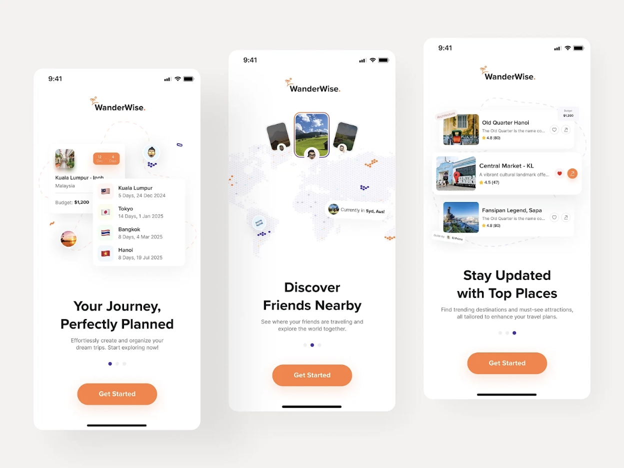
Almost all onboarding flows are educational. Their main job is to educate the user about the system, so the user can then use the system. Each of these messages is all about what you can do with the product. You can discover friends; you can stay updated. The words are not telling you what to do, but they are telling you what you can do.
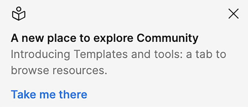
This message in Figma is educating you about a product change. It’s telling you exactly what changed and why.
Inform vs. educate
The difference between the jobs of informing and educating is a tricky distinction. This is a place where content often does both. However, there’s a subtle difference in outcome that’s worth noting because it impacts how you may write a message.
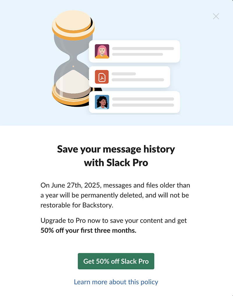
Let’s go back to one of our Slack examples.
Most of these messages are educational, not informational, because the outcome is different. If the job is educational, then the content needs to tell you, “this is how you use it,” which requires action. If the job is informational, then the content needs to tell you, “this is what this is.”
The difference in jobs looks like this, with the informational message first and the educational version second.
One way to think about this: content that informs often focuses on giving the user facts, outcomes, or information, so they have context. An informed user can take the next step, but they might not understand why or what they’re doing. Or an informed user might know that an error is happening, but they might not know how to fix it.
In a real-world example, I need to know when my car needs an oil change, but I don’t have to know how to change the oil myself.
Educating the user is all about giving them the information they need, not just to take the next step, but also to understand the system they are working within. To build their knowledge of the system. An educated user takes the next step and knows exactly the what, why, where, and when of what they’re doing.
Being educated about an oil change means understanding that I have two options: I can do it myself or bring my car to a mechanic. If I choose to do the oil change myself, I receive step-by-step instructions. If I choose to take it to a mechanic, I receive a list of local mechanics to choose from.
To be successful with my car, I don’t need to know how to change the oil myself. I just need to know that it needs to happen. In the same way, users of a product always need to be informed, but they don’t always have to be educated, and it’s up to us to know when and where which one is needed.
Here, messages 1, 2, & 4 are informing you of something: that a process was successful, the state of a password, and that something bad happened. There’s more to message 3. Its end goal is to educate you on how to use the tool better.
Job 3: Sell
To get the user to upgrade or add additional product features by letting them know why it benefits their workflow.
This is done most often with:
- Alerts
- Popups
- Inline text
- Empty states
Examples
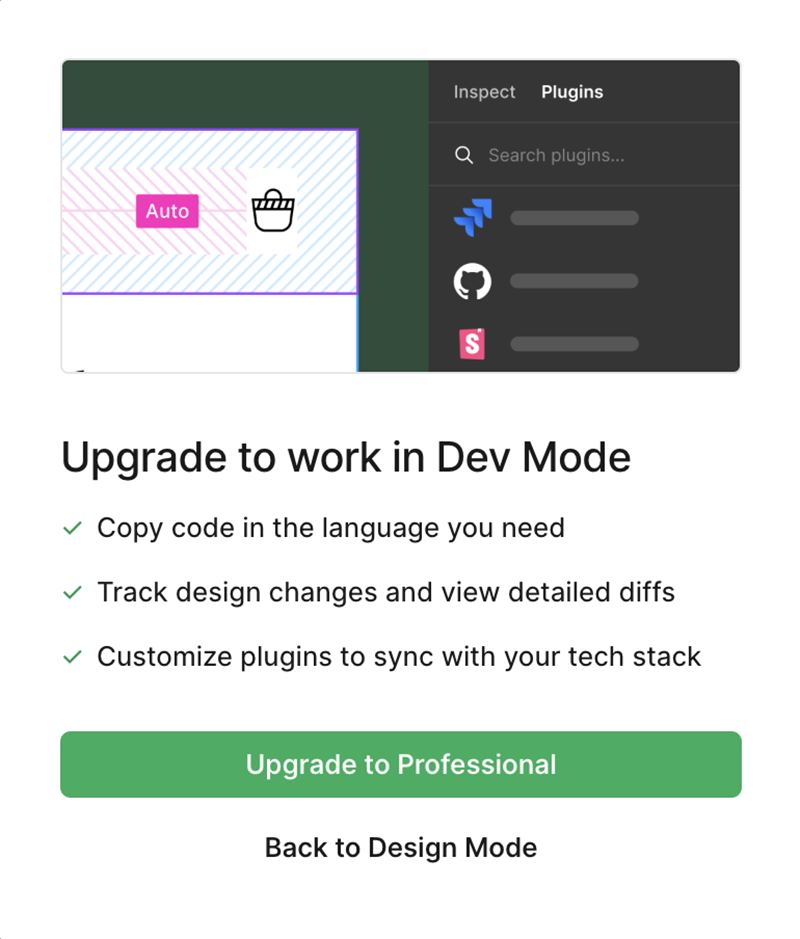
This job is pretty straightforward. The message from Figma is an upsell message, letting you know the benefits you receive by upgrading to a professional seat.
There are no secrets here. To sell something, content needs to help the user feel or see the value of it. If there’s no stated value, it’s not gonna sell. Content that sells is content that establishes value.
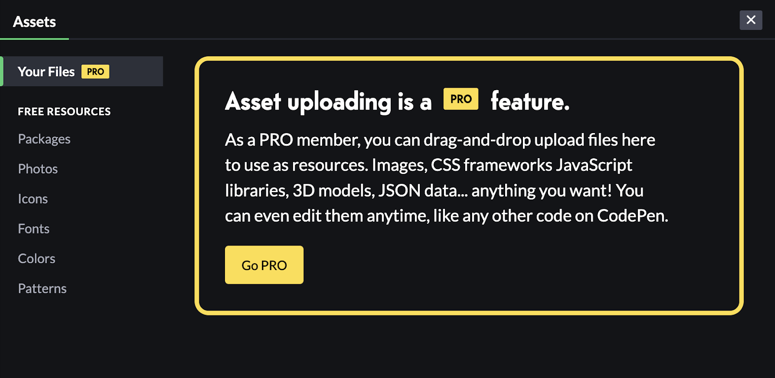
Content that sells is often supported by limits. In this example, the content describes friction that could be removed if you upgrade your subscription.
Job 4: Ask
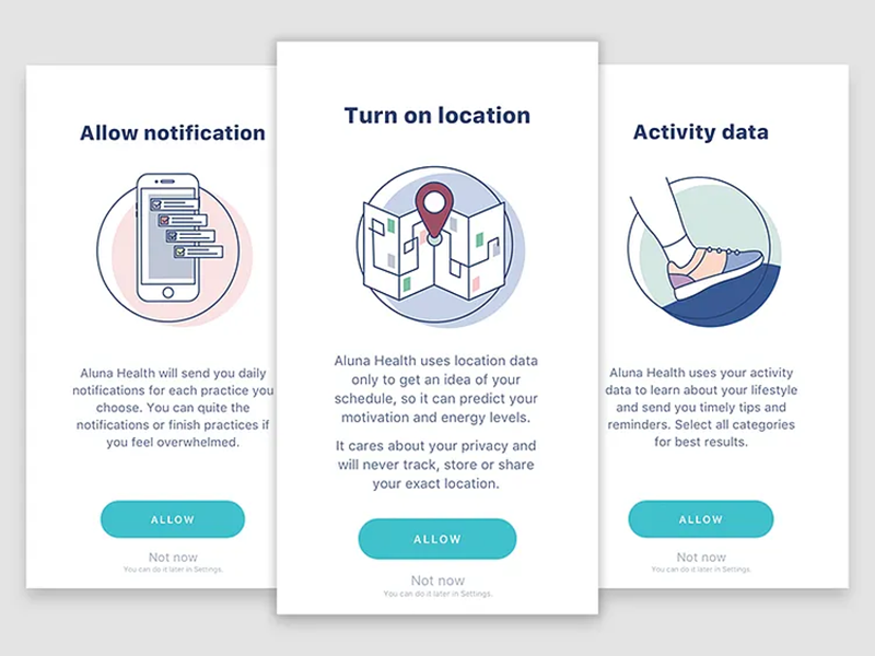
Requests permission, customizes workflow, or gathers information from the user, such as feedback or accuracy of AI suggestions. This is seen more often in mobile experiences.
This is done most often with:
- Panels
- Popups
- Inline voting
Examples
The purpose of content that “asks” is to elicit a user response.
This content provides the user with control over configuring the product, workflow, and other settings.
This content actively invites users to interact with the system, rather than passively waiting for them to do so by chance.
Job 5: Represent
Names, classifies, and organizes, often alongside visuals, system objects, actions, and/or metadata.
This is done most often with:
- Cards
- Detail panels
- Table rows
What are objects?
Everything in a UI represents an unseen system. This hidden system is often made up of objects that are named containers filled with data, attributes that the user interacts with. Content usually has the job of representing these objects in the UI, so the user can know that they exist and then interact with them.
Examples
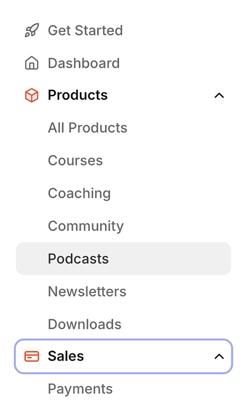
Navigation content is all about representing the system underneath the UI. This example is from Kajabi, a platform that helps people build e-courses. If I click on “Courses,” I go to the area of my product where I can create a new course. When I “create” a course with a name and all its content, it doesn’t just float around in the cloud. All of the data that I created is put inside a “course” object. Then, when I go to my courses list, the UI shows me that course object.
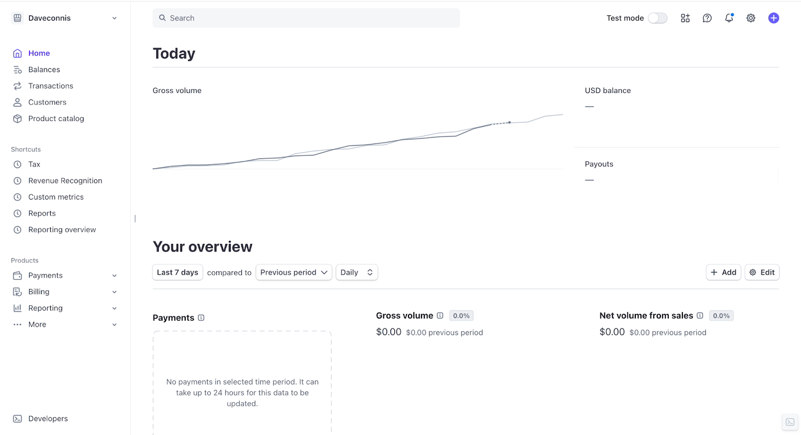
The content on the Stripe home page is nearly all representation. Today, “USD balance,” “Payouts,” “Your overview,” “Payments,” “Gross volume,” etc., are all referring to the system behind the UI. Likely, these labels are attributes, or calculated attributes, of “payment” objects.
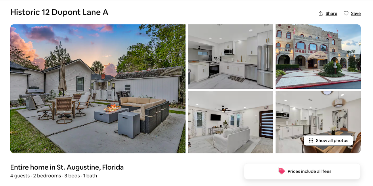
Much of the content above the fold on an Airbnb page represents a “house” object. A house will have a name (Historic 12 Dupont Lane A), a location (St. Augustine, Florida), a capacity (4 guests), etc. These are all attributes that belong to the “house” object, and on this page, the content represents this specific “house” object.
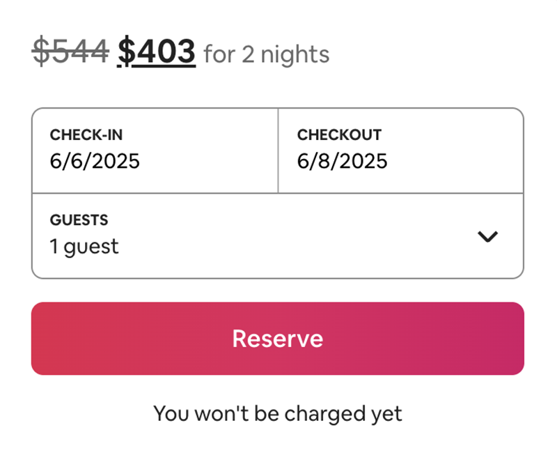
Objects also have actions that can be done to them. For example, what do you do to a “house” object in Airbnb? You reserve it. The word “reserve” represents an action you can take on the “house” object.
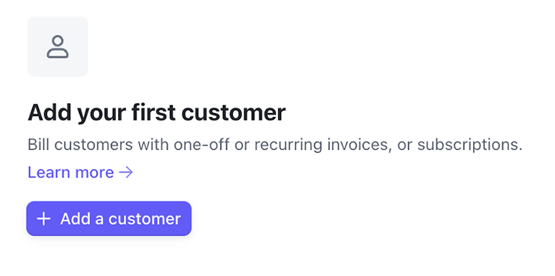
The content in this empty state button represents what a user can do to this system’s “customer” object.
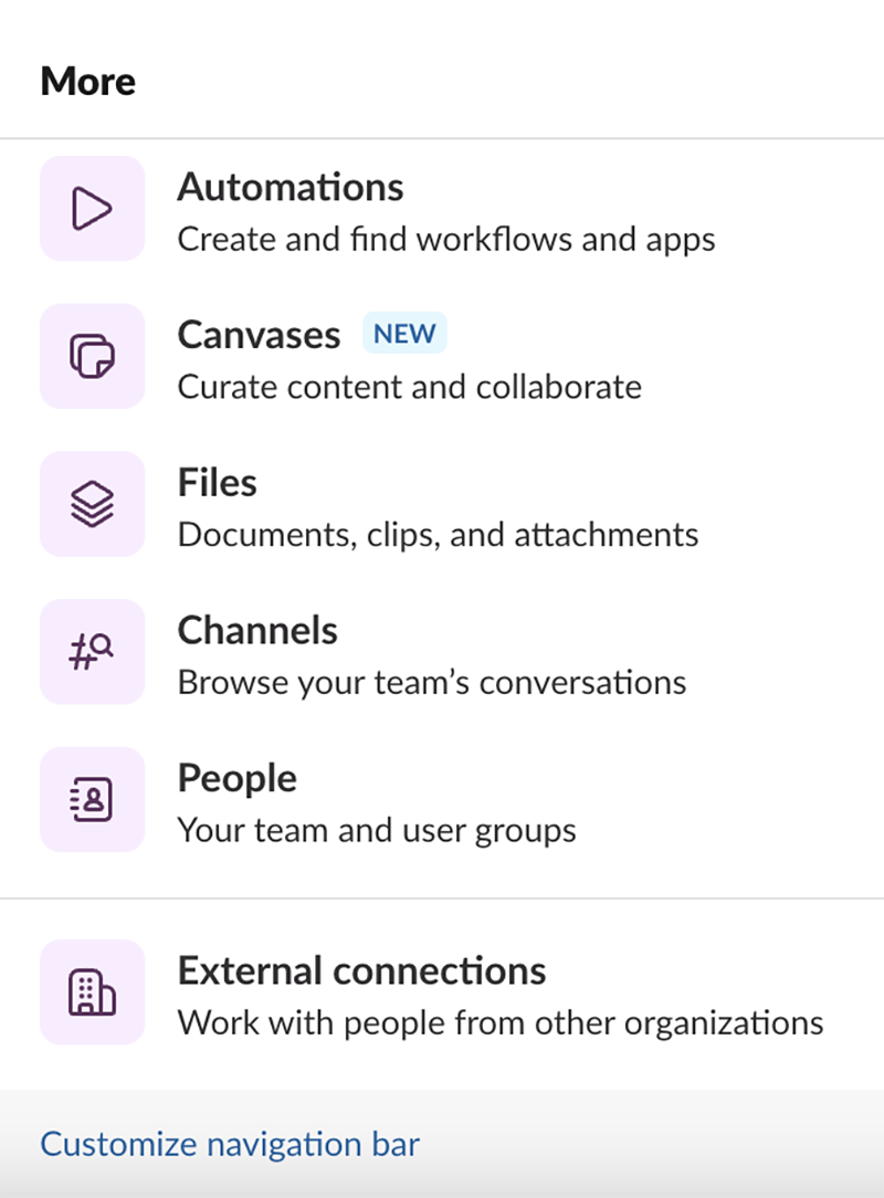
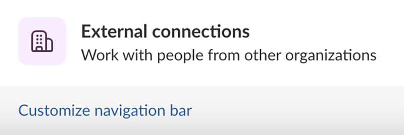
If we go back to the Slack example, many of the bolded labels are representations of objects, including “automations,” “canvases,” “channels,” and “external connections.” While the labels act as names in this list, the content also likely represents the objects in Slack’s code.
Job 6: Instruct
Points the user toward an action: to do something in the product; similar to inform, but with the end goal of inciting action.
This is done most often with:
- Action buttons
- Placeholder text
- Banners and alerts
- Inline text
- Stepped components like wizards
In our Slack example, “Customize navigation bar” is there to instruct the user to take action on the navigation bar. It isn’t informing them of anything (what it is), and it’s not educating them of anything (how to use it). It’s only telling them to do it.
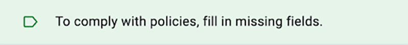
You can set up security policies on Google Docs, and the system will tell you what to do to stay in compliance.
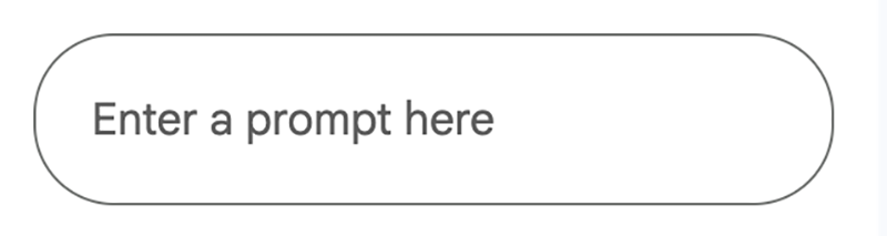
Most placeholder text is instruction, like this input placeholder.
Inform vs. educate vs. instruct
There’s often a thin line between each of these jobs, but it all comes down to outcome. What is the job?
Another example:
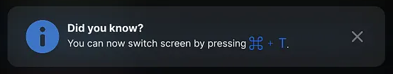
The job of informing content is to tell you “you can do this thing.” Educating content tells you how to do something, and maybe why you’d want to. Instructing content simply tells you to do something. In this case, context matters, right? This is where the expertise of a content designer comes in.
If the user only needed to switch screens to be successful, then the instructing content might be the best fit. If we just wanted to let you know that it’s possible, informing content might be the way to go. If there was a benefit to switching screens, but it wasn’t critical, then we might use the educating content.
Conclusion
So, what’s the point? Why wrestle with all these differences and think about content this way?
Imagine you’re working on a feature, and you get three messages from your team about what a single confirmation message needs to say. With this framework, instead of trying to write one message that doesn’t really do anything, you can have a framework that translates requirements into purpose by asking, “What is the most important job this content needs to do?” This gives you the position to argue for a clear purpose.
Here’s what this might look like. Say you need to design a confirmation message after a user submits a prompt to AI, and this generation will use their remaining tokens for the month. Before you start work, the people on your team send you these Slack messages.
Product Designer 1: This confirmation message needs to tell people they’re about to run out of tokens.
PM: Yeah, we should also use the friction for an upsell.
Product Designer 2: We should also tell the user they can see how many tokens they have left on the home page, in case they missed it.
Engineer: We should tell the user that AI for this other feature will still work even if they’re out of tokens.
You: It seems like the job of the content in this confirmation message is to inform users that they’re going to use all their tokens and that they’ll run out with this specific content generation. If we need to design for upselling or telling users that AI features have different limits, those are different jobs, and we can design for those in more appropriate places.
This framework shifts conversations from the “requirement salad” to focused, measurable objectives, and it allows you to clearly define what a message should be, based on its intended outcome.
Understanding the distinct outcomes of informing versus educating, or the subtle difference between instructing and informing, enables designers to tailor messaging for clarity and impact.
Obviously, edge cases and the interplay between design and content will always exist, but this framework empowers designers to handle the majority of content decisions with intention, leading to a more cohesive and user-friendly product experience.
Join us for Button 2026
Tickets are on sale now! Our virtual conference returns this September with practical talks, live Q&As, and a community that feels like home. Spend two days exploring inspiring content design sessions grounded in real-world work and challenges.